感谢站友们对本人以往所发案例的支持。贰零贰肆年复苏之势日益明显,忙里偷闲,更新一篇案例,再次感谢支持。
项目背景#
本案的项目起名即是地产原来的命名,位于塞上江南——银川。本人自十余年前偶然的朋友介绍,开始于西北陆陆续续接触地产、私宅和公建项目,回首想来,大小项目已接近百套落地完成,而立之年不禁感慨这片土地的缘分奇妙。
The name of this project is the original designation of the real estate, located in Yinchuan, known as the "Jiangnan on the Frontier." I started to get involved with real estate, private residences, and public construction projects in the northwest region more than ten years ago through a friend's introduction. Looking back, I have completed nearly a hundred projects of varying sizes, and as I approach the age of 35, I can't help but marvel at the wonderful fate of this land.
设计概念与故事#
本案来自于一个幸福的四口之家,事业有成的男女主人和一对儿女。二百余平的原始户型相较于形式更偏重家庭使用的实用功能场景。整个空间合理规划为公区面积均衡的玄关、客厅、餐厅、厨房、客卫,以及主卧、次主卧、子卧、起居式书房和一个独立的衣帽间共五个静区房间。整体定位是一个更加侧重于完全是家庭内部所使用的隐私、放松空间,侧重点明确,取舍之间形成最合适居家主人的居住空间。
This case comes from a happy family of four, with successful male and female heads of the household and a pair of children. The original layout of over 200 square meters focuses more on practical functions for family use rather than form. The entire space is reasonably planned to have a balanced public area with an entrance hall, living room, dining room, kitchen, and guest bathroom, as well as a master bedroom, second master bedroom, children's bedroom, living room-style study, and an independent cloakroom, totaling five quiet area rooms. The overall positioning is a space that emphasizes privacy and relaxation, which is completely used by the family, with clear focus points, and the choices made form the most suitable living space for the homeowner.
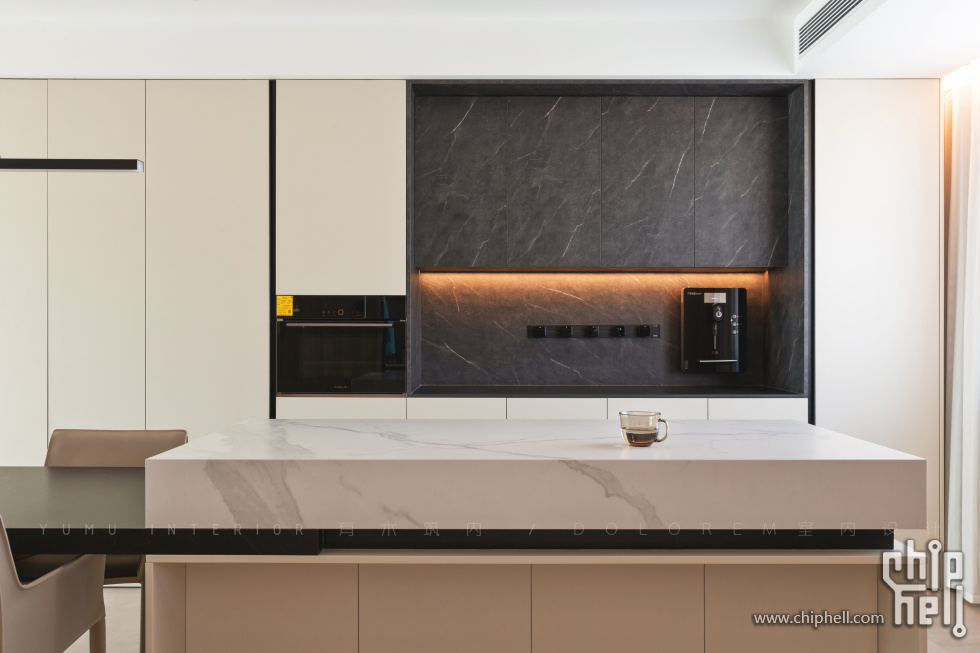
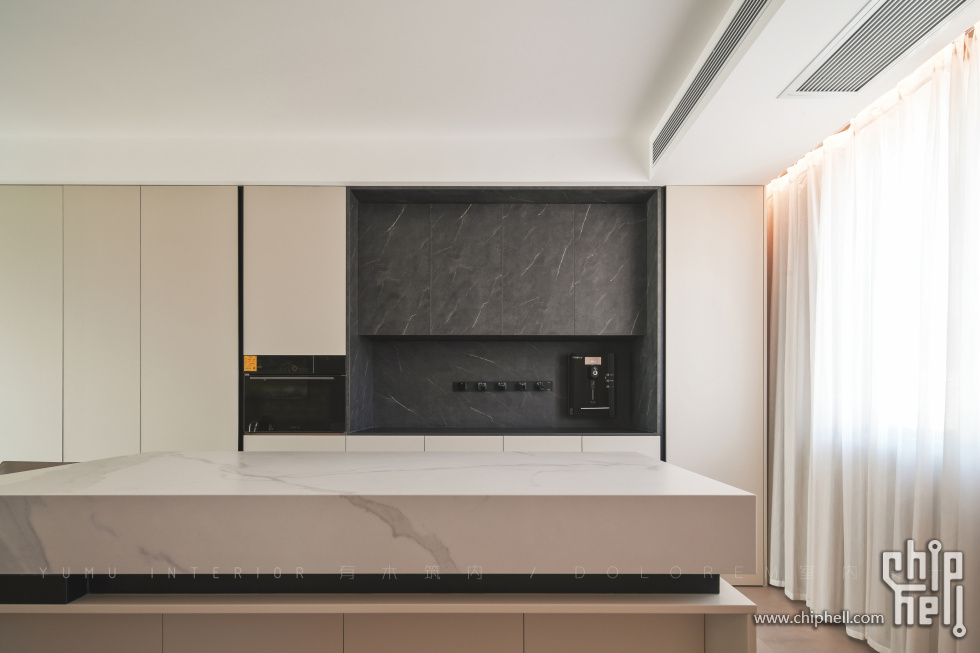
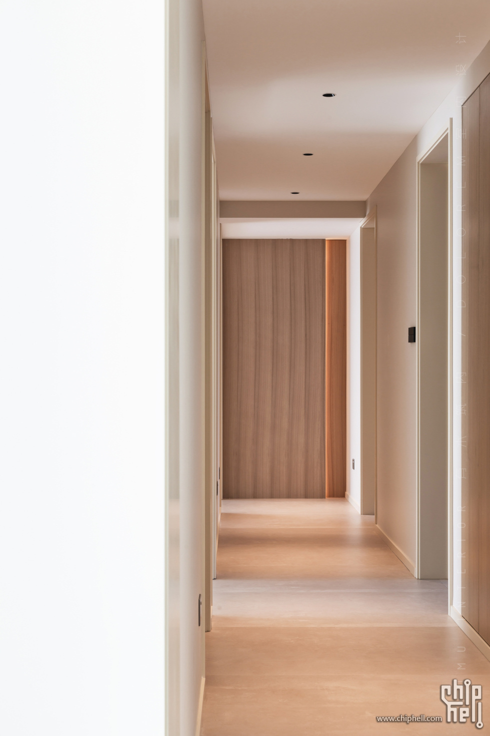
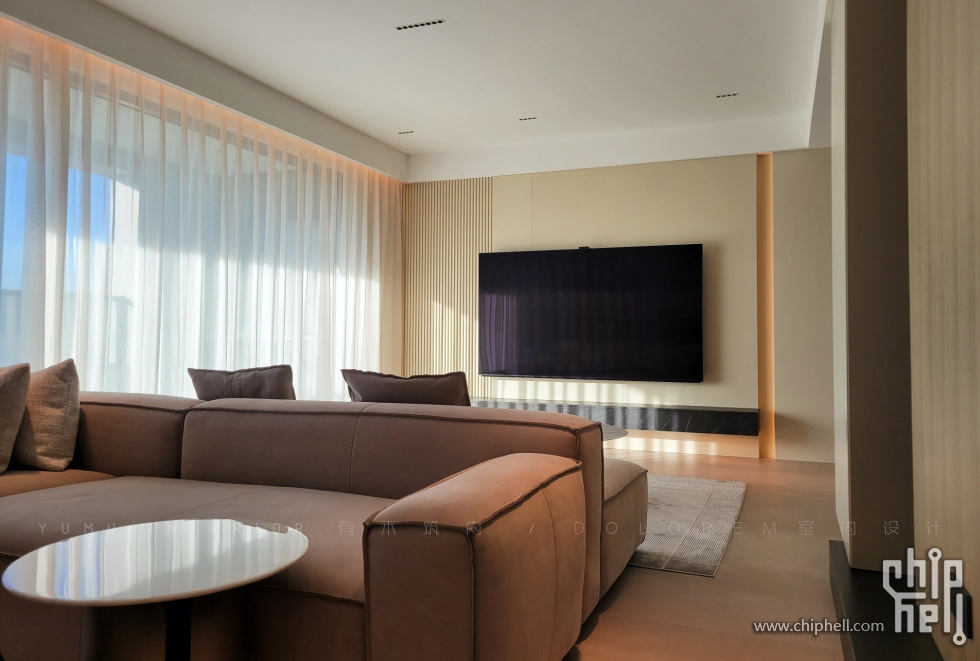
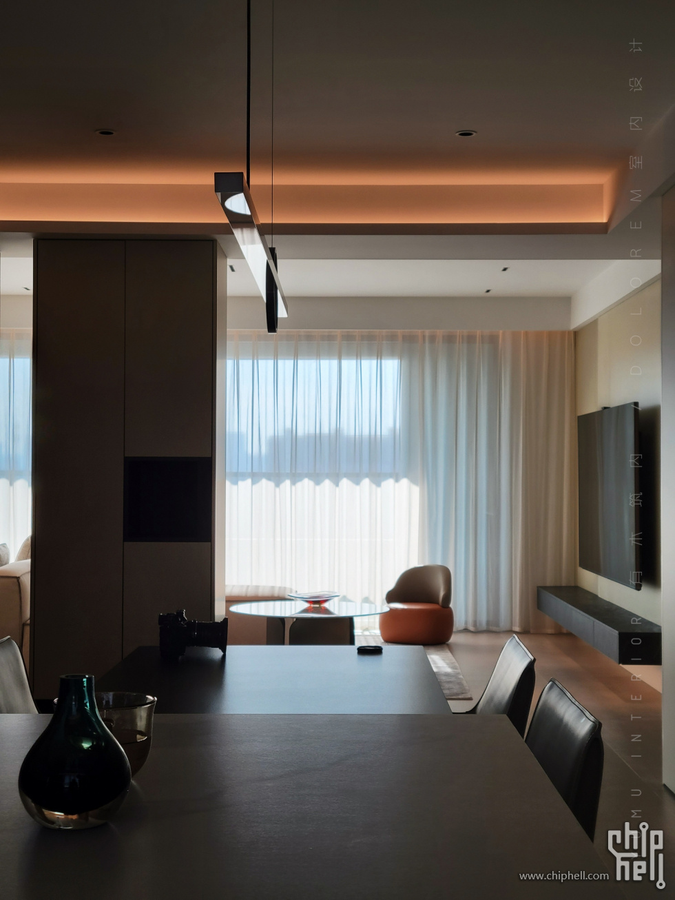
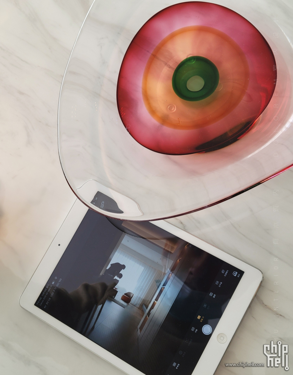
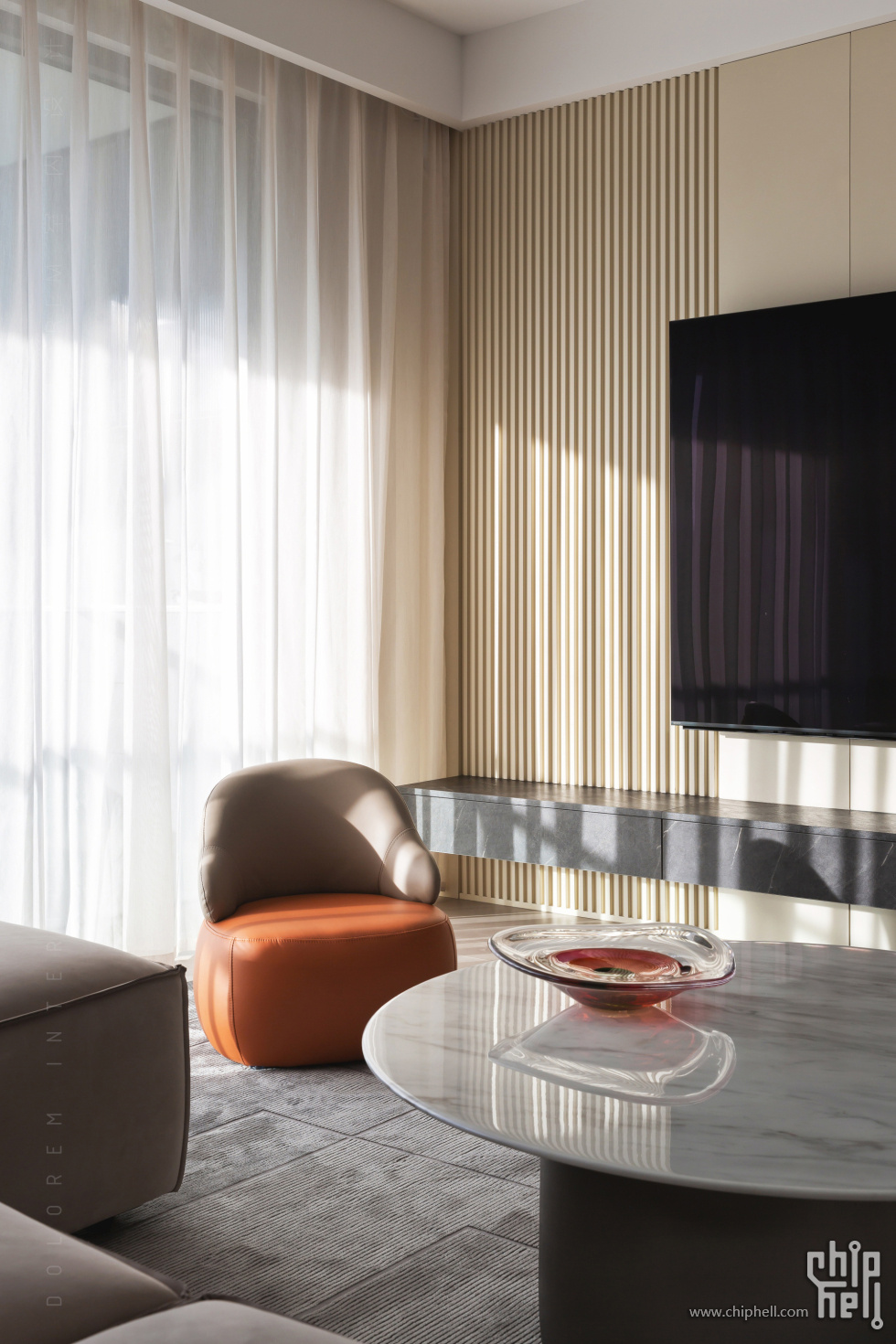
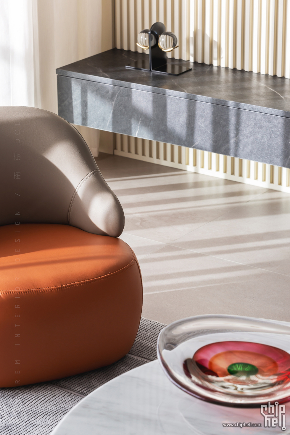
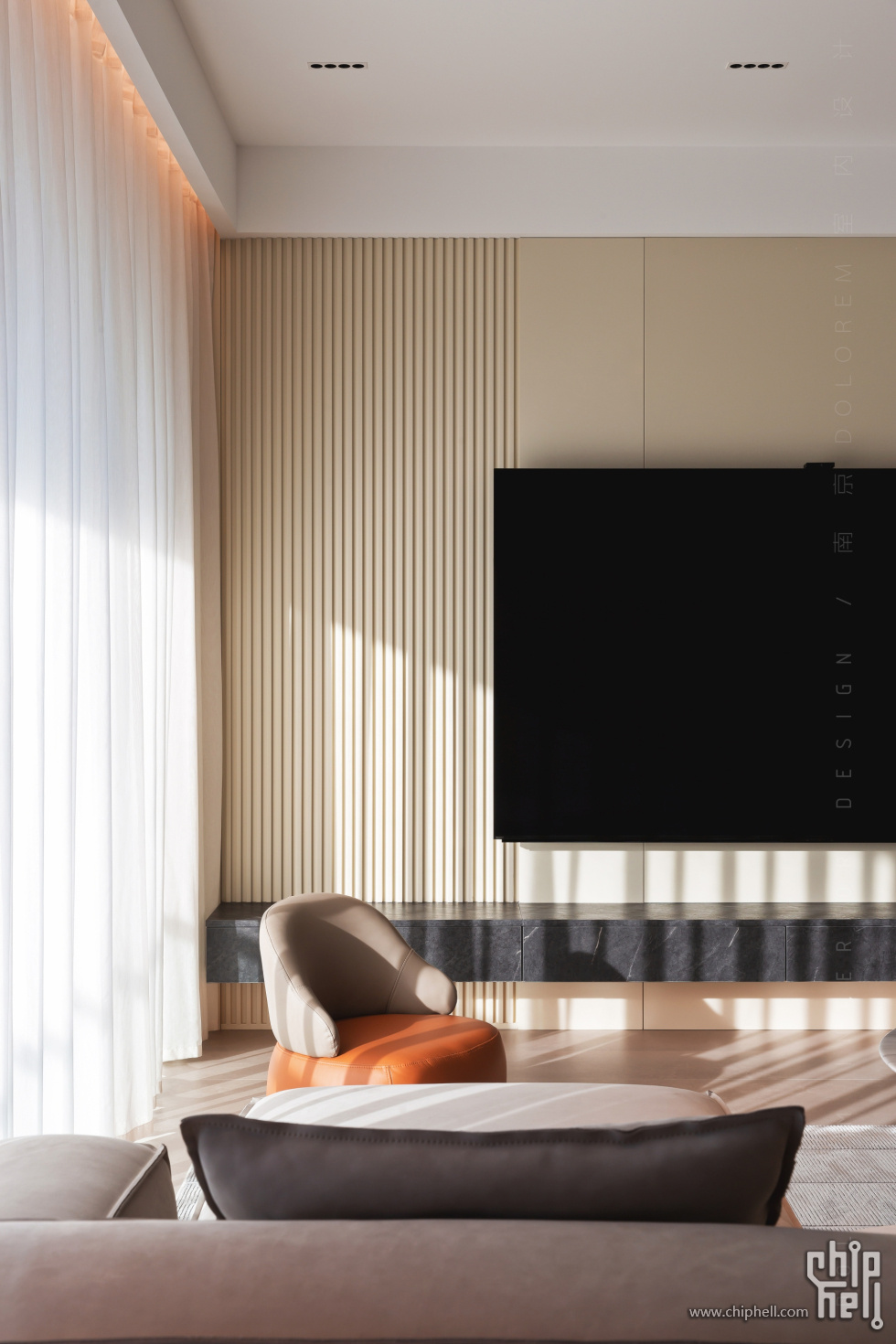
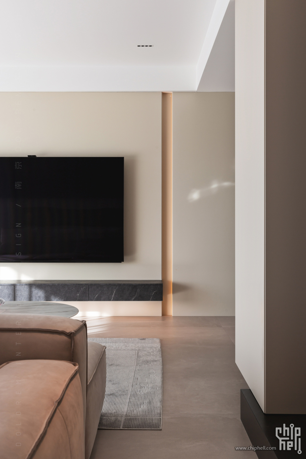
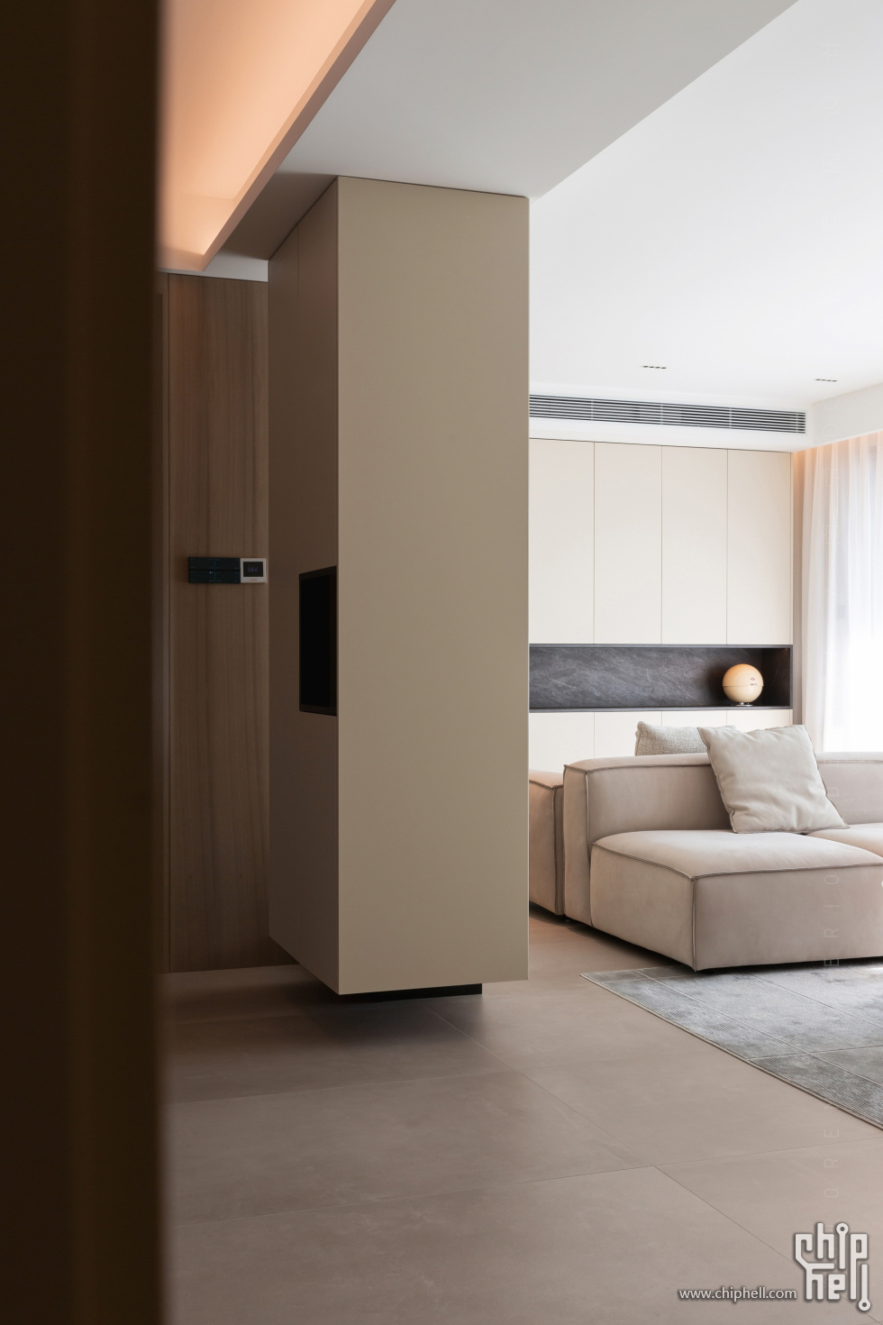
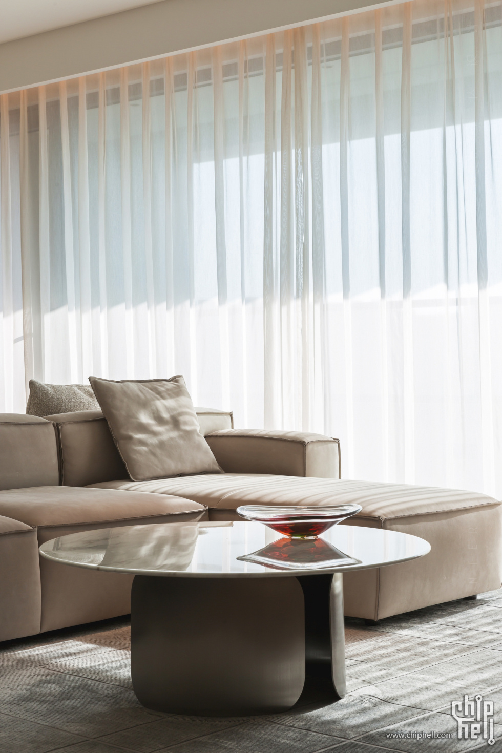
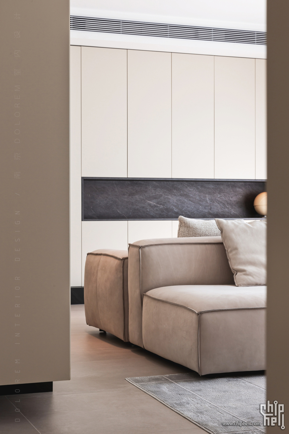
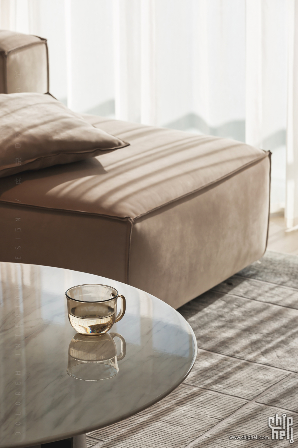
本案整体的物料基础采用温和的胭脂咖色调作为基础,辅以局部点缀的深灰色板材和经典橡木木纹色作为视觉重点,营造出宁静舒适的氛围。软装点缀以明亮的浅色色调,为空间增添活力。相较于近年来各类平台上千篇一律的“奶油风”基调,我们力图从“内建筑”的设计逻辑作为思考的线索,以功能需求为轴,视觉形式为表皮,两者相互结合,辅以空间的相互渗透,最终试图形成一种“看不见过程”的设计结果。
This project material palette for this project is based on a gentle rouge-coffee tone, complemented by deep gray panels and classic oak wood grain as visual focal points, creating a tranquil and comfortable atmosphere. The soft furnishings are accented with bright light colors, adding vitality to the space. In contrast to the ubiquitous "cream style" tones seen on various platforms in recent years, we strive to use the design logic of "internal architecture" as a clue for thinking. Taking functional needs as the axis and visual form as the skin, the two are combined with the interpenetration of space, ultimately attempting to form a design result that is "invisible in the process."
方案效果图#
THE END
DOLOREM室内设计 感谢您的阅读 .
 310112100042806
